Religious products do not need visual gimmicks. That is not the argument. But they do need intention. In fact, I would argue they need more of it, because the tone of the interface shapes how the content is received.
Utility was never the whole point
If the brief had only been functional, Nur could have been finished much faster. Put the content in, choose a standard layout, make sure navigation works, and call it done. But that would have missed the actual gap in the market.
The gap was not that Muslims had zero apps. The gap was that many of those apps felt visually neglected. Dense. Inconsistent. Built with little sense of atmosphere or pacing. Useful, yes, but rarely beautiful in a quiet way.
Nur was designed around the belief that sacred reading should not feel like admin.
Calm is harder than loud
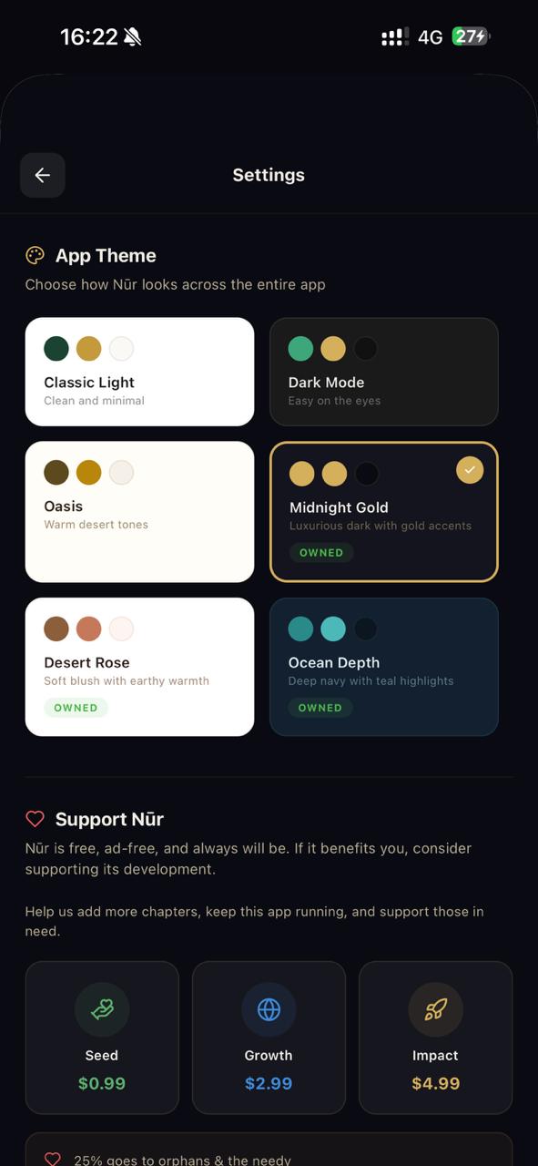
It is surprisingly easy to make an app look dramatic. Dark backgrounds, gold accents, oversized headings, cinematic language. Those moves can be effective for a few screens, but they become exhausting if the entire product leans on them.
The harder job is restraint. Knowing when to pull back. Letting typography breathe. Letting the content lead. Making the interface feel rich without making it noisy. That balance shaped a lot of decisions in Nur, especially around contrast, spacing, and the way the app moves between story, reference, and reflection.
The category deserved a more editorial lens
What interested me most was the space between information and experience. Nur is not trying to become entertainment. But it is also not content with being a lifeless database. There is room in the middle for something more thoughtful, especially when the material includes sacred history, prophetic stories, and the people around them.
That is where the editorial instinct came in. Clear hierarchy. Better rhythm. Pages that open up instead of crowding the user. A tone that feels serious without being cold. In practical terms, that meant thinking more like a publication in some places and less like a form-heavy utility app.
It also says something about the studio
Nur is part of AH Labs, which means it is more than a side project. It is a statement about what the studio notices and what it cares to improve. A lot of agencies claim product thinking because they once designed a dashboard. That has never been a very convincing standard to me.
Real product thinking shows up when you are willing to sit with a category, notice what feels neglected, and build something more considered even when the market is not screaming for it in obvious language.
That is why Nur belongs on the AH Labs page. It shows taste, product judgment, and a willingness to build around meaning instead of chasing whatever seems easiest to sell.
Why this matters beyond one app
The best thing internal products do is sharpen your client work without announcing it. Nur made me more sensitive to pacing. More alert to tone. Less tolerant of clumsy hierarchy. It reinforced the idea that digital products can feel composed without becoming sterile.
That sensibility carries over. Into websites. Into software tools. Into case studies. Into the whole studio standard. In that sense, Nur is not just a product. It is part of the taste education of the business.
If you want the broader lab context, it lives on the Nur section of AH Labs. If you want the founder logic behind why this kind of product matters here, that story sits on the About page.